Sandusky is a vibrant, welcoming small town on the shores of Lake Erie with 200+ years of rich history and a burgeoning potential for growth and creativity.
To drive year-round tourism, development, and residency in America’s Best Coastal Small Town (according to USA Today), Destination Sandusky needed an identity that proudly displayed the energy of its community—one that respected the city’s past while also looking toward the future.
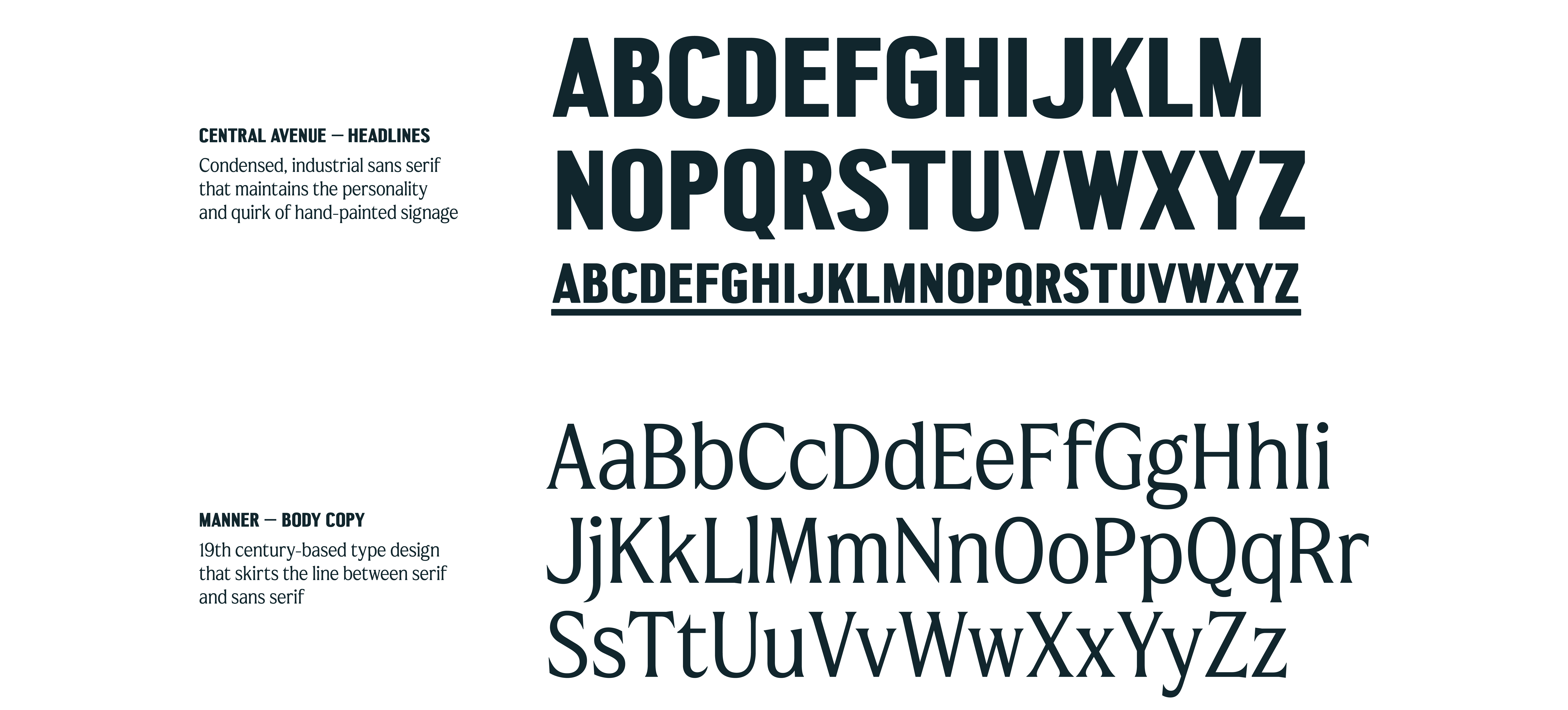
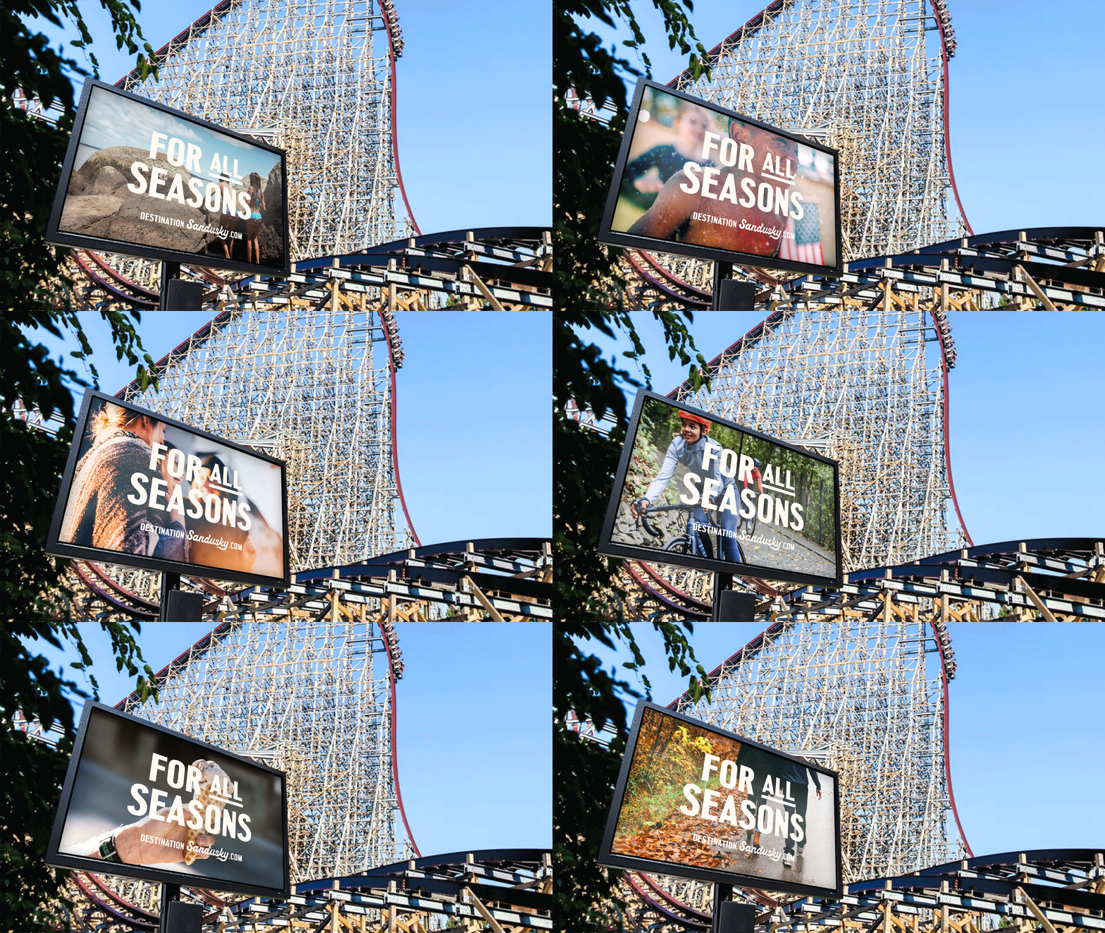
To make the brand feel uniquely Sandusky, its color palette is taken from downtown architecture and the local landscape, and compositional layouts are determined by the city’s historic Kilbourne Plat street grid. A custom handlettered logo and vintage-inspired illustrations add a nostalgic, Americana feel while bold typography and active language keep the identity fresh and forward-facing.


role graphic design, art direction
agency Little Jacket (2023)
junior designer & illustrator Abby Coe
creative director & copywriter Roger Frank
creative director & letterer Joey Parlett
agency Little Jacket (2023)
junior designer & illustrator Abby Coe
creative director & copywriter Roger Frank
creative director & letterer Joey Parlett